Text formatting & managing amounts of text: How to make your website easy to read

When someone visits your website, they're not arriving with a cup of tea thinking, "I can't wait to read every paragraph." They're arriving with a mission: to find something important quickly.
This means your website text needs to work harder than you may think. Good text formatting isn't about looking stylish or trendy — it's about helping visitors instantly understand what your business does, who it helps, and how they can take action.
At Mozello, we see thousands of websites created every year using our website builder for small business owners, personal brands, nonprofits, shops, and everything in between. And one of the biggest obstacles beginners face is… too much text presented the wrong way.
The good news? With just a few simple formatting rules, your website will instantly feel more professional, more readable, and more trustworthy. You don't need design skills. You don't need coding knowledge. You only need structure, clarity, and a few smart habits.
Let's dive in.
Why text formatting matters so much
Good formatting helps your readers do two important things:
1. Scan the page quickly
Most people don't read websites top to bottom — they scan for keywords, headings, and visual cues. If your text is a wall of paragraphs, their eyes will give up before their brain even gets to the content.
2. Understand what's important
Formatting is a quiet guide. It tells your visitor:
- "Start here."
- "This part matters."
- "This is the next step."
Bad formatting creates confusion. Good formatting creates confidence. And confidence is what gets someone to contact you, buy something, or book an appointment.
The #1 beginner mistake: The big wall of text
Let's start with the biggest offender.
Bad Example:
We are a family-owned construction company that has been operating for more than 15 years and we pride ourselves on providing high-quality work, excellent customer service, and customized solutions for residential and commercial clients. Our mission is to deliver outstanding craftsmanship using durable materials and modern techniques so you can feel confident about your investment. We offer renovations, roofing, interior and exterior finishing, and more. Contact us today for a consultation.
This is only one paragraph, but it already feels overwhelming. Everything looks equally important — which means nothing feels important.
Good Example:
Family-Owned Construction Company with 15+ Years of Experience
We provide high-quality work, excellent customer service, and reliable solutions for both residential and commercial projects.
What we offer:
- Renovations
- Roofing
- Interior finishing
- Exterior improvements
Our mission is simple: deliver outstanding craftsmanship using durable materials and modern techniques — so your investment lasts.
Ready to start? Contact us for a free consultation.
Same information. Very different experience.
How much text should you have? (A simple rule)
People often ask us: "How much text should I put on my website?"
Here's the answer:
Enough to explain your message clearly, but not more than your visitor needs right now.
In practical terms:
- Your homepage should be short and skimmable (like a movie trailer).
- Your about page can be more detailed but still structured.
- Your services page should be clear, direct, and well-divided into sections.
- Your product pages should use short paragraphs, bullet points, and key benefits.
The goal is clarity — not minimalism. People need information, but they need it in pieces they can digest fast.
How to format text like a pro (Even if you're not one)
Below are simple, practical techniques you can apply right away.
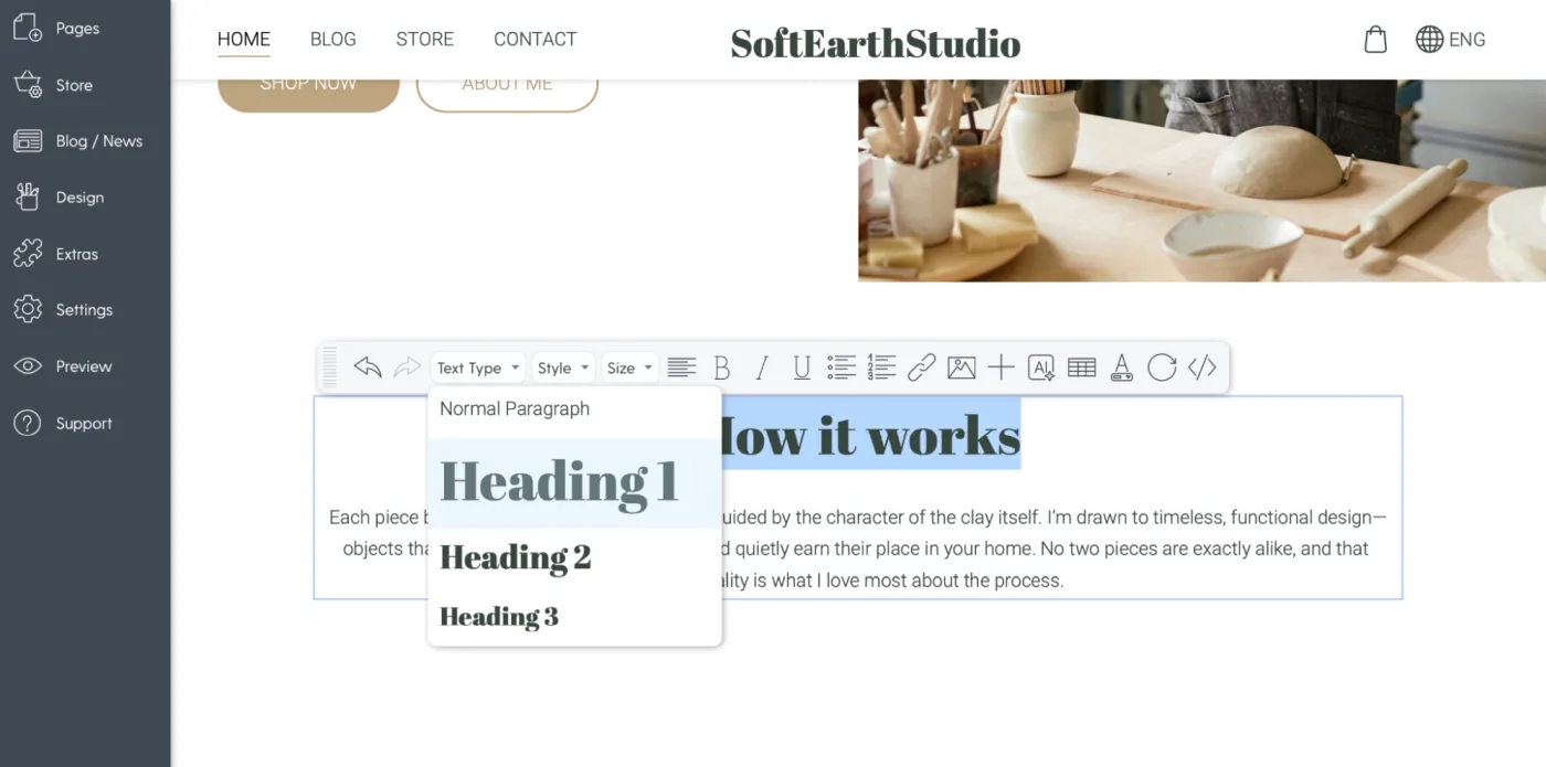
1. Use headings to break up content
Headings act like road signs.
They tell the reader:
- Where they are
- What comes next
- Why it matters
In Mozello, you can use Heading 1, Heading 2, Heading 3 and so on.
You don't need to understand the technical meaning - just use them to create structure.
Bad Example (no headings):
Our spa offers massages, facials, and wellness packages designed to help you relax…
Good Example (with headings):
Our Services
Massages
Relaxing, therapeutic, and deep-tissue options.
Facials
Customized treatments for hydration, anti-aging, or cleansing.
Wellness Packages
Bundle services for a full day of relaxation.
Instantly easier to read.
2. Keep Paragraphs Short
The biggest readability secret is this:
One paragraph = one idea.
Most paragraphs should be:
- 2–4 lines on desktop
- 3–5 lines on mobile
Long paragraphs feel intimidating. Short paragraphs feel friendly.
Good Example:
We make sourdough bread using a natural 48-hour fermentation.
This slow process creates a richer flavor and healthier loaf - without preservatives or additives.
Fresh bread is baked daily, and we offer wholegrain, rye, and gluten-free options.
Same information. Much more readable.
3. Use Lists When Explaining Multiple Points
If your sentence contains commas, explanations, or multiple items…
turn it into a list.
Bad Example:
Our gym offers cardio classes, strength training, yoga sessions, and personal training programs for all levels.
Good Example:
What we offer:
- Cardio classes
- Strength training
- Yoga sessions
- Personal training
This format:
- Helps scanning
- Gives the eye rest
- Highlights what matters
When creating a website, these details make an enormous difference.
4. Highlight Important Words - But Don't Overdo It
Bold text is powerful. It helps you highlight:
- key benefits
- important numbers
- action steps
But if everything is bold, then nothing is bold.
Use bold like this:
Our mission is to help small businesses grow through simple, clean, effective web design.
Not like this:
Our mission is to help small businesses grow through simple, clean, effective web design.
This makes your text feel chaotic. Use bold to draw attention, not to decorate.
5. Use Clear, Simple Language
Good web writing is not academic. It's not complex.
It's friendly, direct, and easy to understand.
Use:
- short sentences
- everyday words
- direct explanations
Avoid:
- jargon
- technical terms
- poetic or overly creative wording
Bad Example:
Our digital agency leverages cutting-edge methodologies to maximize user-centered touchpoints.
Good Example:
We help businesses create websites that are easy to use, modern, and built for results.
Speak like a human, not a brochure.
6. Divide Content Into Sections
Big pages must be divided into logical chunks.
Common structure examples:
- About → Mission → Story → Team
- Services → Individual Service Blocks → Pricing → FAQ
- Homepage → Hero → Benefits → Services → Testimonials → CTA
Mozello lets you add sections with one click, which makes structuring your content simple.
Think of sections as "breathing spaces" for your visitor.
7. Use Callouts for Important Messages
A callout is a short, important piece of text you want people to notice. It can be:
- a quote
- a guarantee
- a key benefit
- a special message
Example:
All repairs come with a 2-year warranty — at no extra cost.
This breaks the flow in a good way. Callouts help important information stand out naturally.
Common formatting mistakes (And how to fix them)
1. Too many fonts
Mozello makes this easy - you can choose a predefined font combination with one click.
Never use more than 2 fonts.
2. Centered text everywhere
Centering is good for:
- headings
- short sentences
- CTAs
Not good for long paragraphs.
3. Writing for yourself instead of your visitor
Readers want answers, not stories.
4. Informal formatting "habits"
Too many exclamation marks, ALL CAPS, bold everywhere, or random colors make your site look unprofessional.
5. Putting everything on the homepage
Your homepage is the "front door," not your whole business card.
Let your inner pages carry the details.
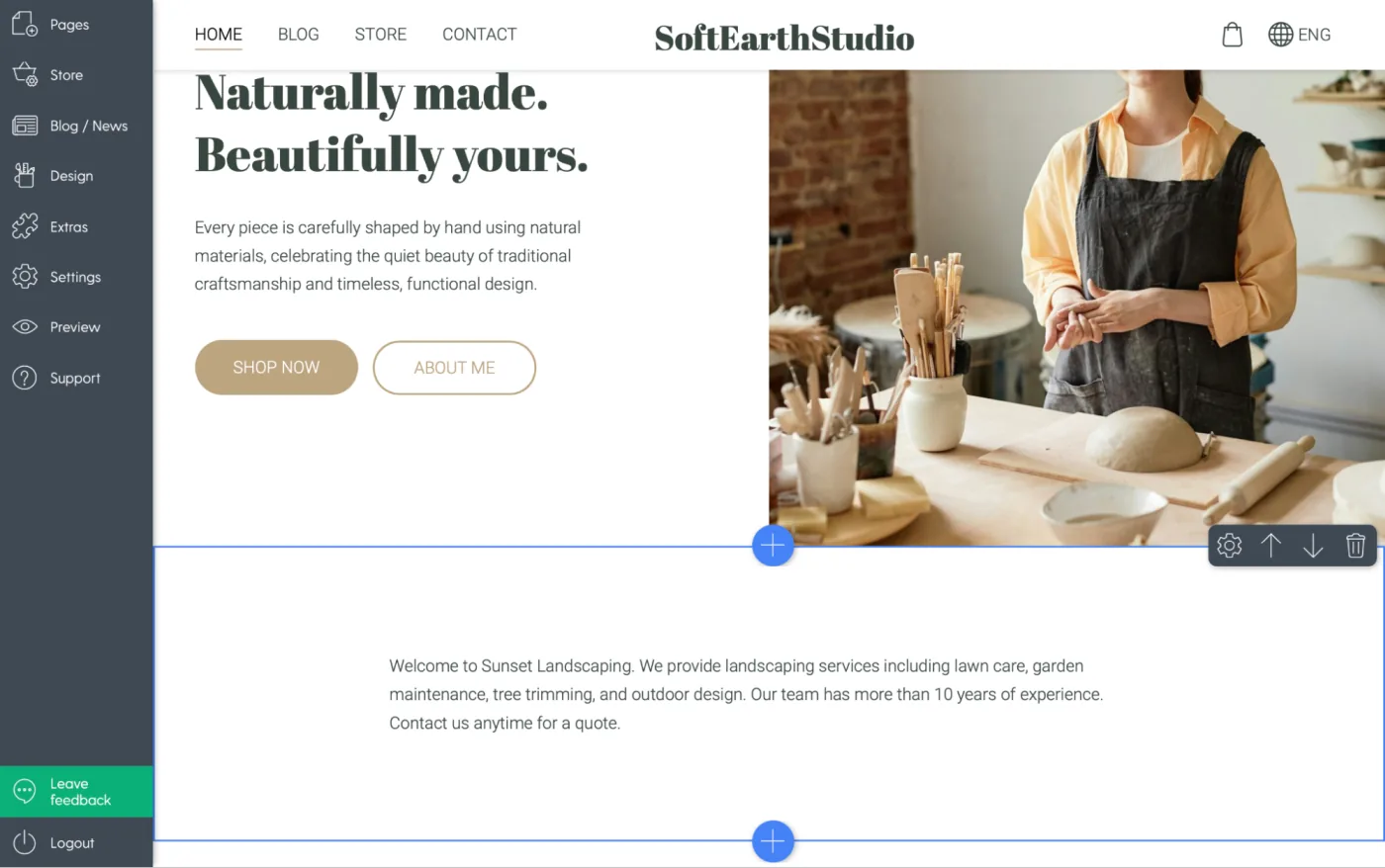
Before & after: A realistic transformation
Before
Welcome to Sunset Landscaping. We provide landscaping services including lawn care, garden maintenance, tree trimming, and outdoor design. Our team has more than 10 years of experience. Contact us anytime for a quote.
This is plain, dense, and easy to ignore.
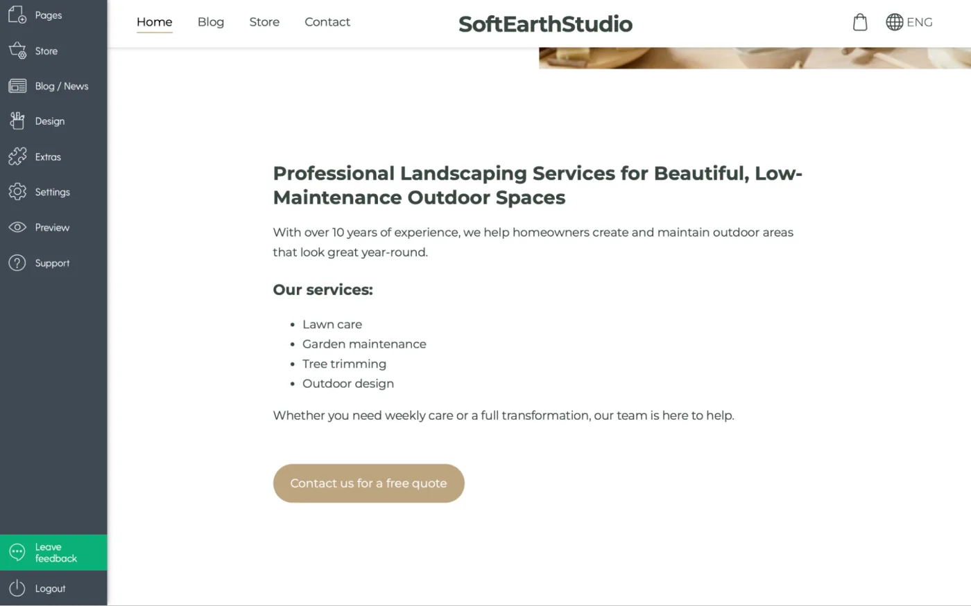
After
Professional Landscaping Services for Beautiful, Low-Maintenance Outdoor Spaces
With over 10 years of experience, we help homeowners create and maintain outdoor areas that look great year-round.
Our services:
- Lawn care
- Garden maintenance
- Tree trimming
- Outdoor design
Whether you need weekly care or a full transformation, our team is here to help.
Contact us for a free quote.
Clear, organized, and inviting. This is the difference good formatting makes.
How Mozello makes this even easier
One of the advantages of using Mozello as your website builder is that you don't need any technical knowledge to format your text beautifully.
Here's how we help you build a website that is clean and readable:
1. Easy section layout blocks
Add spacing, structure, and readable layouts in seconds.
2. Pre-selected typography pairs
We've already done the font-matching for you.
3. Clean formatting tools
Headings, lists, bold text, quotes — everything is just one click away.
4. Mobile-friendly by default
Your text always adjusts to small screens automatically.
For small businesses, this is extremely important. Clear text = more customers reading what you offer, understanding it, and taking action. Whether you're creating a website from scratch or updating one you already have, these tools help you stay professional and consistent.
Final thoughts: Good formatting = good experience
You don't need to be a designer to present your content well.
You only need:
- simple structure
- short paragraphs
- clear headings
- visually clean sections
- readable typography
- enough white space
When you manage your text well, your website becomes easier to navigate, easier to trust, and easier to act on.
And with Mozello's website builder for small business owners, formatting your content is simple, intuitive, and fast — no technical skills required. If you want to build a website that feels professional, friendly, and easy to read, Mozello gives you the tools you need to do it confidently.
More articles in this series
- What is good web design and why it matters
- How to choose colors for your website
- How to choose fonts for your website
- How to use white space in web design
- How to format text on your website
- How to create visual identity for your website
- How to create effective call-to-actions
- How to organize your website like a designer
- How to create clear website navigation
Download our free Best web design practices checklist that will help you review your website step by step.