Page layout & balance: How to organize your website like a designer
When someone visits your website, they make a judgment in less than a second. It's not about your text, your logo, or even your photos - it's about how everything is arranged on the page.
A well-structured, balanced page tells visitors exactly where to look, what's important, and what they should do next. Poorly organized pages, on the other hand, create confusion and frustration - and visitors leave before even learning about your business.
At Mozello, we know that small business owners want their websites to feel professional and organized, even if they've never touched a design tool before. That's why our website builder relies on structured, pre-designed content blocks with simple, preset options for spacing and sizes - so you can focus on your content without worrying about technical layout decisions.
This guide will teach you everything you need to know about page layout and balance, with clear explanations, practical examples, and beginner-friendly tips.
What is page layout and why it matters
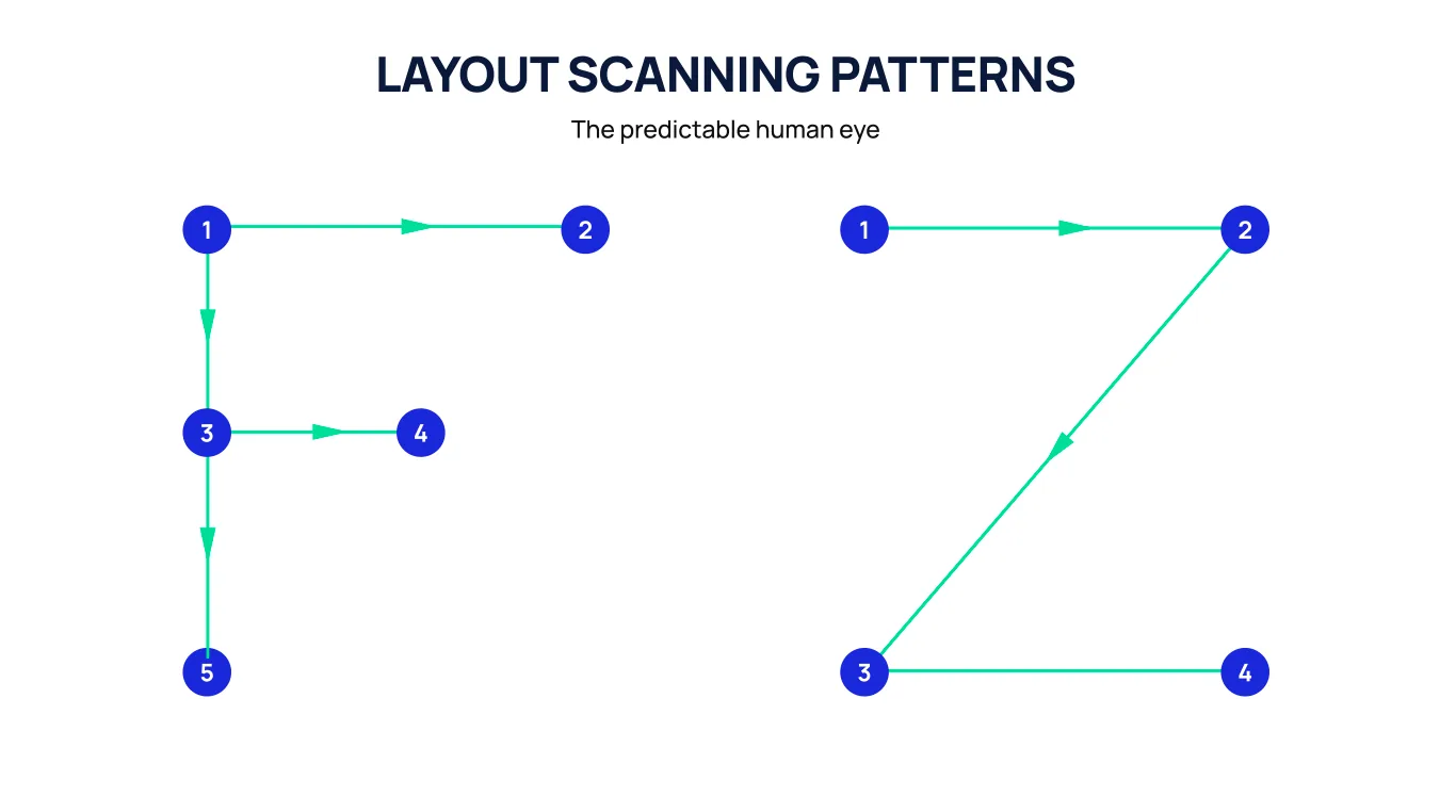
Page layout is the order in which a visitor's eyes naturally move across your page.
A clear layout guides visitors step by step:
- Look here first
- Notice this next
- Explore this detail
- Take the next action
Without layout, your visitors have to figure out the most important content themselves. This creates confusion and leads to lost opportunities.
Why layout matters
- Highlights what matters most
- Leads visitors naturally through your story
- Makes the website feel professional and easy to read
- Increases trust and conversion
Think of layout like a tour guide. Without guidance, your visitors wander aimlessly. With guidance, they experience your website exactly as you want them to.
Understanding visual weight
Not everything on a page is equally important. Some elements naturally draw more attention, which designers call visual weight.
Things that increase visual weight include:
- Large text and headlines
- Bold or contrasting colors
- Placement near the top of the page
- Images of people or products
- Buttons or interactive elements
- White space around an element (surprisingly, empty space makes content feel important)
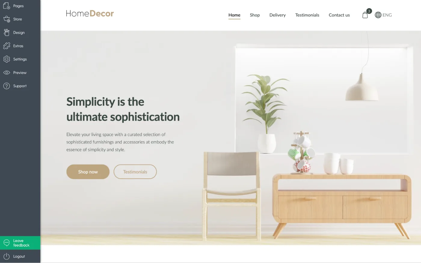
With Mozello, you don't need to manually calculate these details. Each content block already applies professional spacing and alignment rules. You can further tweak top and bottom spacing with a few simple presets: Small, Medium, or Large. This gives your page breathing room and rhythm without ever needing a design degree.
Banner blocks also have preset sizes (Small, Medium, Large), which keeps images and hero sections visually balanced and proportionate across your page. The result? A page that looks polished and professional with minimal effort.
The four main layout types
Designers organize content into layout patterns to make pages visually appealing and readable. Even if you've never designed a website before, you've seen these patterns in action. Mozello's blocks make using them simple.
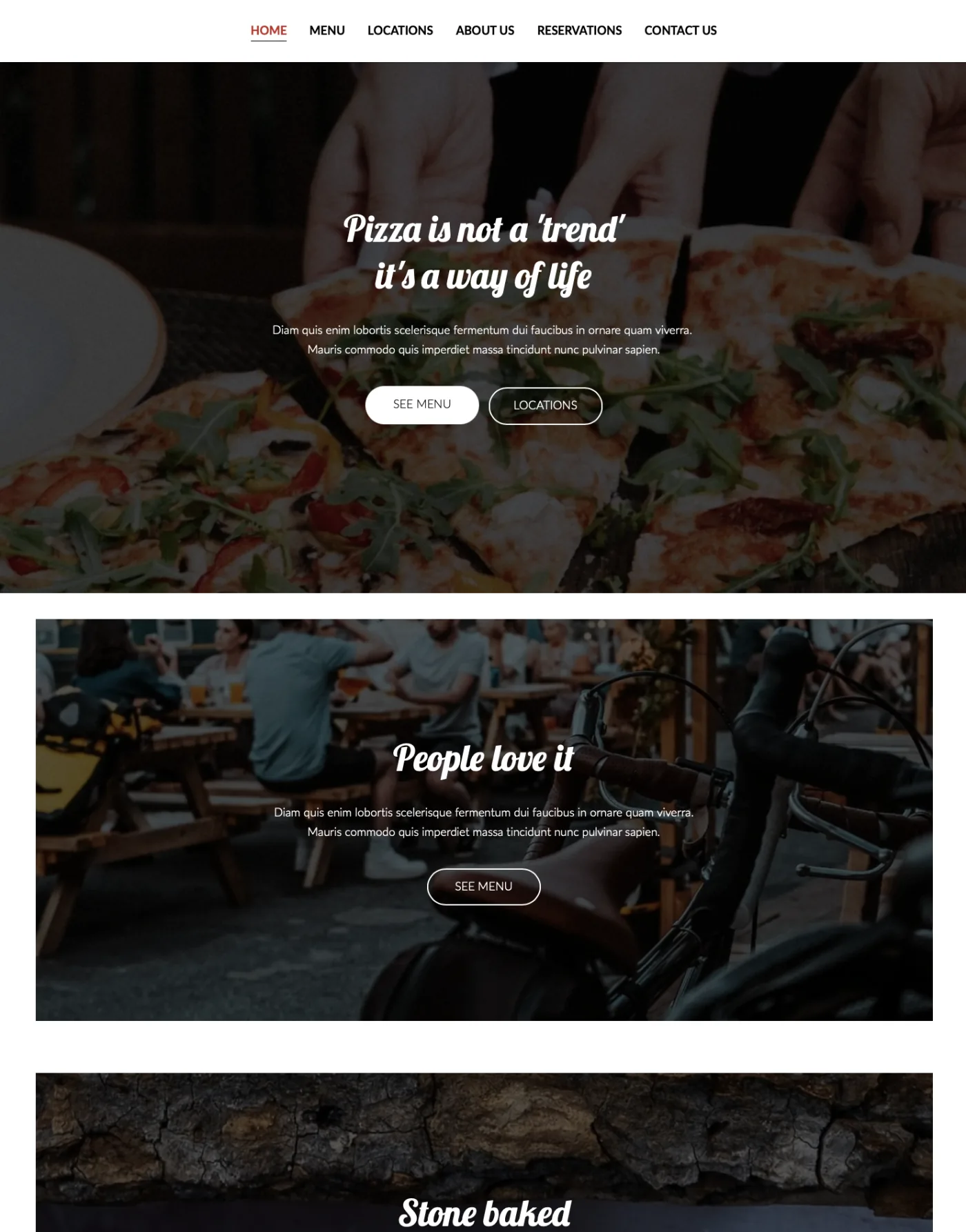
1. Symmetrical layouts
What it is: Equal balance on both sides of a page - centered text, centered images, evenly spaced sections.
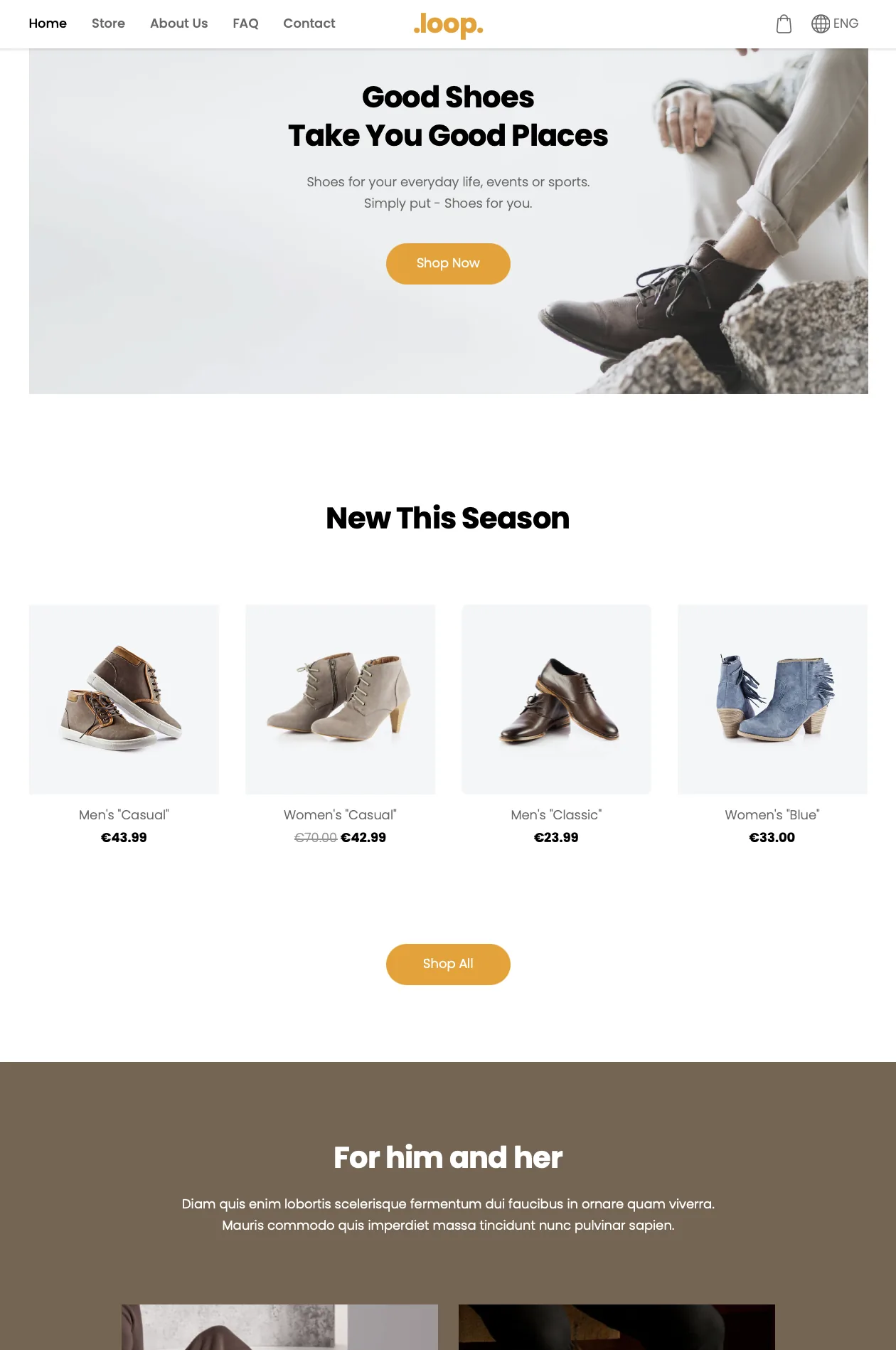
How it feels: Calm, professional, trustworthy.
Best for:
- Consulting
- Corporate websites
- Wellness or spa services
- Premium brands
Many hero and text blocks default to symmetrical layouts. Pair them with balanced spacing (Small, Medium, Large) for a clean, professional look.
Example: A centered headline, brief subheadline, and CTA button below a centered image.
Common mistake: Long paragraphs in a symmetrical block can make the layout feel cramped. Keep content concise.
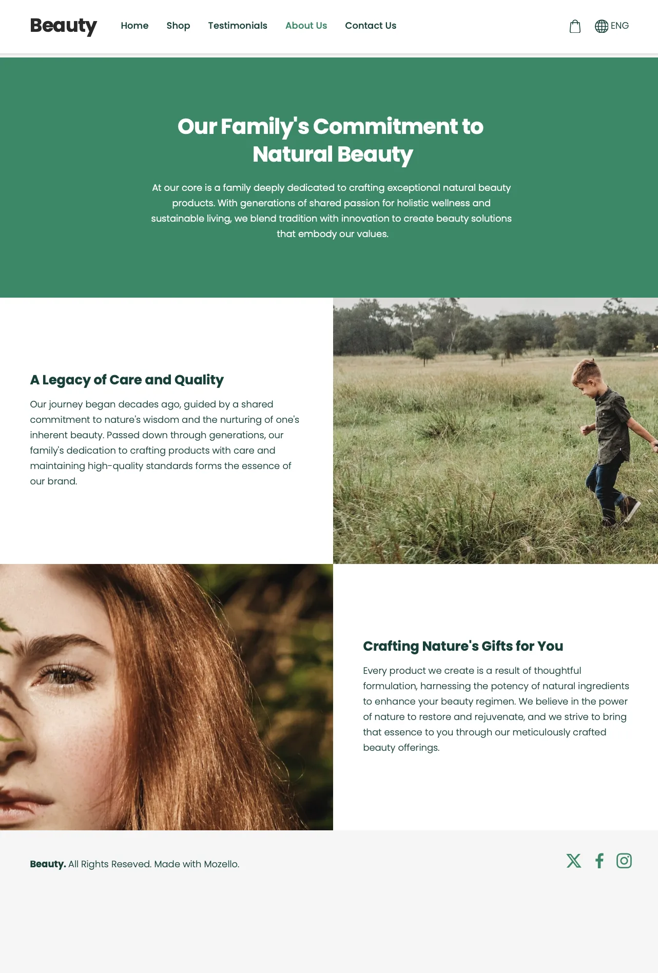
2. Asymmetrical layouts
What it is: Unequal visual distribution - e.g., image on one side, text on the other.
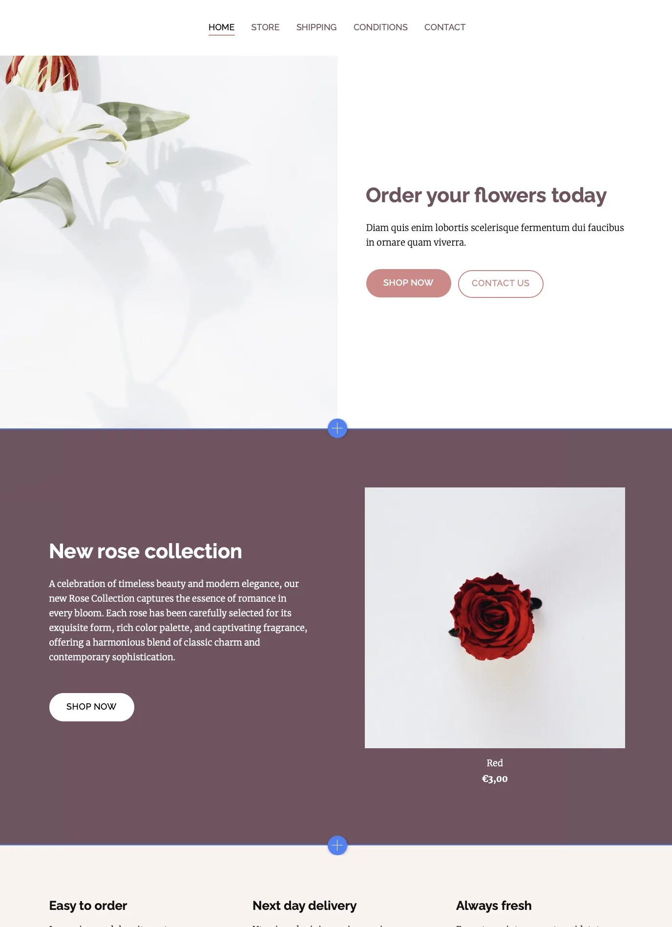
How it feels: Dynamic, modern, engaging.
Best for:
- Creative businesses
- Portfolios
- Product or service presentations
Use "image-left, text-right" or "image-right, text-left" blocks. The built-in spacing presets maintain balance even if one side has more content.
Example: Large product image on the left, short headline and description on the right with a CTA.
Common mistake: Long text paragraphs can overwhelm the image, disrupting balance. Stick to concise descriptions.
3. Mosaic layouts
What it is: Alternating or varied block arrangements that create a visually rich flow - think collage or magazine style.
How it feels: Stylish, expressive, editorial.
Best for:
- Photography portfolios
- Handmade products
- Lifestyle brands
Mozello tip: Alternate text + image blocks or gallery blocks with consistent image style.
Example: Alternating images and short text sections telling a story step by step.
Common mistake: Mixing drastically different image styles or sizes, which can make the page look chaotic.
4. Stacked layouts
What it is: Simple vertical arrangement of content blocks.
How it feels: Direct, clear, easy to read.
Best for:
- Service pages
- Product pages
- Landing pages
Mozello tip: Stack hero → problem/benefit → features → testimonials → CTA.
Common mistake: Adding decorative blocks or unrelated content disrupts the flow.
Step-by-step: Building a balanced page in Mozello
Step 1: Define the purpose of the page
Ask:
"What is the main action I want visitors to take?"
Examples:
- Book a consultation
- Buy a product
- Learn about services
- Contact us
Step 2: Start with a hero section
Choose a hero block with:
- Headline
- Subheadline
- Clear CTA
- Optional image
Step 3: Add content in logical order
- Explain the problem/benefit
- Show features or offerings
- Include social proof or testimonials
- Optional gallery or image blocks
Step 4: Adjust spacing for rhythm
- Use Small, Medium, or Large spacing between blocks
- Ensure breathing room and visual flow
- Adjust banner sizes for proportional emphasis
Step 5: End with a clear CTA
- Repeat your main action
- Ensure it stands out from other content
By following these steps and using Mozello's blocks with spacing presets, even beginners can create pages that feel professional and intentional.
Checklist for balanced pages
Ask yourself:
- Do I know where to look first?
- Are my paragraphs short and readable?
- Is there enough breathing room between blocks?
- Do my images look like they belong together?
- Does my main CTA stand out?
- Does each block serve a purpose?
Answer "yes" to most of these, and your page layout is working.
Common beginner mistakes and how to avoid them
- Too much text in one block – keep paragraphs short.
- Random image placement – use consistent styles and sizes.
- Too many different CTA styles – stick to one or two.
- Ignoring spacing – Mozello presets make it easy to maintain consistent.
- Skipping the layout – always plan the flow of the visitor's attention from headline → content → CTA.
Why Mozello makes page balance simple
Unlike drag-and-drop builders, Mozello uses structured blocks with preset options, which:
- Keep alignment and proportions consistent
- Limit spacing and banner sizes to well-tested options
- Maintain balance automatically while giving you simple control
- Work seamlessly across desktop and mobile
This lets you focus on telling your story, not fighting with the layout.
Final thoughts: Balance builds trust
A balanced page is readable, clear, and visually appealing. It guides visitors naturally, builds trust, and leads them to action.
With Mozello's block-based system and preset spacing options, creating balanced pages is easy, even for beginners. All you need to do is choose the right blocks, set spacing (Small, Medium, Large), and organize your content thoughtfully.
Good design isn't magic. It's clarity, order, and intention.
And with Mozello, every small business can achieve it - no design experience required.