Clear navigation: Helping visitors find what they need without thinking

When someone visits your website, they don't spend much time figuring things out. They want to find what they're looking for quickly, without scrolling endlessly or guessing where to click.
Even if your website looks beautiful and your content is perfect, poor navigation can frustrate visitors and cause them to leave.
Navigation isn't just a list of links. It's the roadmap of your website, showing visitors where to go, what's important, and how to explore your content logically.
In this guide, we'll explain how to create clear, intuitive navigation using Mozello, considering both menu structure and style, footer management, and beginner-friendly best practices.
Why navigation matters
Think of your website like a store. If aisles are cluttered, shelves are messy, and nothing is labeled, customers leave quickly. Your website works the same way. Visitors need guidance and structure.
Clear navigation helps:
- Reduce confusion: Visitors instantly know where to find pages.
- Highlight important content: Your products, services, or information are easy to locate.
- Support logical flow: Visitors move naturally from one section to another.
- Boost credibility: A well-organized website feels trustworthy and professional.
Poor navigation wastes your content, no matter how good it is.
Mozello navigation features that help beginners
Mozello simplifies navigation for beginners:
- Adjustable main menu with optional dropdowns for subpages.
- Multiple menu layouts: Choose from logo left, logo center, logo top, or other styles. Adjust your number of menu items based on layout for balance. Each layout has a slightly different approach for best usability.
- Footer section control: Select which pages appear, keeping the header uncluttered.
- Mobile-friendly menus automatically adapt to screen sizes.
- Readable, professional templates ensure your menus are visually clear across devices.
With these tools, even beginners can create intuitive, professional, and functional navigation.

Choosing the right menu layout
Different menu layouts affect how many menu items you should display and how visitors perceive your site:
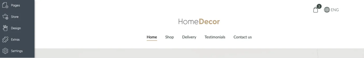
1. Logo left, menu centered
- This layout looks balanced for small to medium menus.
- Works well with 4–6 main menu items.
- Dropdowns can be used for subpages without cluttering the top menu.
2. Logo left, menu left or right
- Aligning the menu to one side works well for medium menus.
- Slightly more flexibility in number of items compared to centered menus.
- Keep spacing consistent and avoid overloading the menu.
3. Logo top, menu below
- Ideal for sites with longer menus or more sections.
- Provides extra space to display more menu items without feeling cramped.
- Works well for business sites that need multiple pages visible upfront.
4. Logo centered, menu items left
- Visually striking and modern.
- Works best with fewer menu items (3-4) to avoid imbalance.
- If your site has many pages, consider using a different layout or dropdowns to maintain clarity.
Choosing the right layout is essential. It ensures your menu is readable, balanced, and easy to use, no matter how many pages your website has.
Best practices for clear navigation
1. Keep the menu simple
Simplicity is key. Too many menu items overwhelm visitors and make it harder to find important content.
- Limit your top menu to 4–7 primary pages whenever possible.
- Use clear, descriptive labels such as "Services," "About," or "Portfolio."
- Avoid confusing jargon. Visitors should understand each page at a glance.
Example:
Instead of "Our Comprehensive Solutions for Every Client Need," use "Services."
2. Prioritize important pages
Order matters. Place your most critical pages first in the menu, typically:
- Home
- About
- Services / Products
- Blog / Portfolio
- Contact
Dropdowns can be used to group related subpages without cluttering the main menu. Reordering pages in Mozello is easy, letting you highlight what's most important for visitors.
3. Use consistent naming
Consistency makes your website feel professional and builds trust.
- Menu labels should match buttons and links throughout your site.
- Avoid using multiple terms for the same action.
Example:
If your menu says "Contact", don't label a button "Get in Touch." Stick with one label to avoid confusion.
4. Avoid overcrowding menus
While dropdowns are helpful for subpages, too many levels can confuse visitors:
- Limit dropdowns to a single level if possible.
- Use the footer for secondary pages, such as privacy policies, newsletters, or FAQs.
- Keep the header focused on the most important pages.
By carefully balancing menu and footer content, visitors can find key pages quickly without feeling overwhelmed.
5. Make menus visually clear
A menu should be immediately readable:
- Ensure text colors contrast with the background.
- Use subtle hover effects to indicate clickable items.
- Keep menu text readable on both desktop and mobile screens.
Mozello templates are designed to maintain readability and accessibility, but it's worth testing your menu on multiple devices to ensure clarity.
6. Optimize for mobile
More than half of all web traffic comes from mobile devices, so mobile navigation is essential:
- Mozello menus automatically collapse into a mobile-friendly "hamburger" menu.
- Keep menu labels short and easy to tap.
- Avoid nested dropdowns that are difficult to use on touchscreens.
Even with Mozello handling responsive design automatically, it's good practice to check how your menu looks and feels on a small screen.
7. Use the footer strategically
The footer acts as a secondary navigation area for supporting pages:
- Include links to less critical content, like Privacy Policy, Terms, or Blog.
- Decide which pages should appear in the header versus the footer. Not everything needs to be in both.
- Organize the footer logically so visitors can still find information without cluttering the main menu.
Common navigation mistakes and how to avoid them
Many beginners make mistakes that reduce usability. Here's what to watch for:
- Too many menu items: Overcrowding makes it hard for visitors to know where to go. Focus on key pages and use dropdowns sparingly.
- Vague or confusing labels: If a link doesn't describe the page clearly, visitors may skip it. Use simple, understandable labels.
- Inconsistent terminology: Switching terms across your website causes confusion. Keep labels consistent.
- Placing all pages in both header and footer: Some pages should only appear in one location. Use the header for critical pages and the footer for secondary content.
- Ignoring menu layout impact: Different menu styles (centered logo, logo on top, etc.) require different numbers of menu items for balance. Too many items in a centered layout can look cramped and unbalanced.
- Poor mobile usability: Menus that are too long or complex can frustrate mobile users. Keep it simple and test on devices.
Example of effective navigation
Imagine a small bakery website:
Header: Home | About | Menu | Gallery | Contact
Footer: Privacy Policy | Terms | Newsletter | Blog
How visitors move through the site:
- Hero section introduces the bakery
- Featured products → visitors explore offerings
- Gallery → visual storytelling of products
- Testimonials → credibility
- Footer → secondary links for policies and newsletter
This layout ensures visitors never feel lost. The main menu is clear and balanced, while the footer provides additional content without cluttering the top navigation.
Final thoughts: Navigation is the map of your website
Clear navigation is not optional — it's the path your visitors follow to explore your website.
When navigation is simple, consistent, and well-structured:
- Visitors feel confident
- They can find key pages quickly
- Your website feels professional and trustworthy
With Mozello's menu layouts, adjustable menus, and footer controls, creating navigation that works for both desktop and mobile is simple. Focus on clarity, simplicity, and balance, and your visitors will naturally explore your site and find the content they need.
This is the last article of Mozello's Best Website Design Practices series, but you can go back to any of the articles at any time: